
A graphic giving information about proposed construction projects.
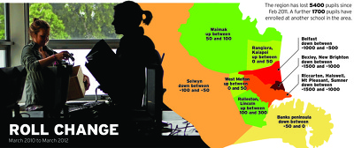
An infographic showing school roll changes in Canterbury.

A graphic comparing the salaries of Canterbury mayors.

A two-page feature titled, 'The Land Report'.

A map showing the locations of earthquake fatalities.

A map showing the locations of earthquake fatalities.

An infographic charting aftershocks since 22 February 2011.

A map showing the status of hill suburbs.

A chart showing the status of EQC claims.

A graph showing changes in residential building work.

Graphs showing the status of business insurance claims.

A map showing the location of fault lines.

An infographic giving details of proposed temporary housing.

A map of the Canterbury A&P Show.

An uncompleted map showing the locations of aftershocks.

An infographic describing damage to the Arts Centre.

A banner with the headline, 'A nation remembers'.

A chart showing the status of EQC claims.

A page banner promoting an article about EQC.

A graphic showing cruise ships in Akaroa harbour.

An infographic showing the proposed Addington City Stadium.

A graphic showing the cost of the earthquakes.

A page layout for the "Faultlines" special report.

A chart showing the status of EQC claims.
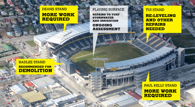
An infographic showing the status of AMI Stadium.

A graphic giving crime rate statistics for Canterbury.

A chart giving statistics for earthquake-related injuries.

An infographic charting aftershocks on 11 March 2011.

A graphic giving information about the Transitional Cathedral.

A page banner promoting articles about the rebuild.